How to use Heurio
Change Screen Size
Review your website at desktop, tablet, or mobile sizes from inside the Heurio extension. Each heurio also captures the exact viewport it was created at for context.
How to change screen size in Heurio
Total time: 1 min- Step 1
Pick a default device size
After turning on the Heurio extension, open the device dropdown in the top right corner of the Heurio overlay and choose a preset (desktop, tablet, or mobile).
- Step 2
Or resize the browser window manually
For custom viewport widths, simply resize the browser window. Heurio captures whatever width is active when you create a heurio.
- Step 3
Check each heurio's captured device info
Open any heurio's details and find the Device Info section — Heurio records the viewport size, OS, and browser version at the moment the heurio was created.
Quick answer: open the device dropdown in the top-right of the Heurio overlay and pick desktop, tablet, or mobile — or just resize the browser. Every heurio remembers the viewport it was created at.
Switching device sizes helps you test your website across different devices, ensuring it works well for all users. It simplifies the process of testing your website across different screens, providing clear feedback and enhancing collaboration. This is part of Heurio's broader effort to make responsive design reviews painless.
#How it Works
-
Select a Default Device Size:
- After activating the Heurio extension, you can choose from various device sizes, such as desktop, tablet, or mobile. This allows you to see how the website appears and functions on different screens.
- Use the device dropdown menu in the top right corner to make your selection.
-
Manual Resizing:
- You can also manually resize your browser window to a custom size, giving you more flexibility to test at different resolutions.
-
Device Information:
- Heurio stores the screen size at the time each heurio is created. This information can later be found under the "Device Info" section, providing valuable context for your team.
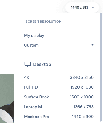
Selecting a default device size in the Heurio extension.
#Why This Matters
-
Cross-Device Testing:
- Testing your website on various devices helps identify and fix issues early, ensuring it looks and functions as intended across all screens.
-
Contextual Feedback:
- Stored device information allows team members to understand the context of each comment, making feedback clearer and easier to act on.
-
Consistent User Experience:
- By evaluating your website across devices, you can ensure it delivers a smooth and intuitive experience to all users.
Frequently asked questions
- Does Heurio emulate mobile devices like Chrome DevTools?
- Heurio lets you switch the visible viewport between desktop, tablet, and mobile presets. For full device emulation (touch events, user agent strings, DPR), use Chrome DevTools alongside Heurio — both can run at the same time.
- Will my heurios stay tied to the right element when I resize?
- Yes. Each heurio is anchored using a DOM selector, not a pixel coordinate, so it stays attached to the same element across viewport sizes.
- What screen size is recorded with each heurio?
- The exact pixel viewport width and height at the moment the heurio was created. Teammates can see it in the heurio's Device Info section in both the extension and the web app.
- Can I review a fully responsive design at multiple breakpoints?
- Yes. Switch device size, leave a heurio at that breakpoint, then switch again and leave another. Each comment is timestamped with its own viewport so you can compare desktop, tablet, and mobile feedback in the same project.